I Think We Found Something – The Art of Sonic Lost World
I want to preface this article by saying it is not a full review of the latest Sonic title, Sonic Lost World. This is an observation and a retrospective of something that has been long since lost to the Sonic Team at Sega. I have not played this game. I have no idea how it handles, the responsiveness of the controls the differences between its two console versions, difficulty curve, nothing. But one thing that shines through more to me without ever picking up a controller is the art design. The art design in this game is simply the best this series has had since the days of Sonic 2 on the Sega Genesis.
Being the resident “Retro Game Lover” around VideoDestruct.com and a graphic designer by trade this is an aspect of gaming that really appeals to me. And Sonic the Hedgehog has always been an intellectual property that has thrived heavily from his fantastic character design. With all the bad reputation and poor game reviews this IP has accumulated over the years, it’s arguable that the only reason he still exists is because of the appeal that comes with his model. Bright colors, sharp angles and a form that conveys speed (exactly what his games are all about) Sonic is one of the greatest designs for a video game character in history.
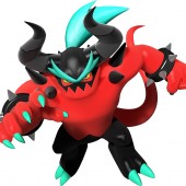
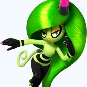
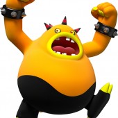
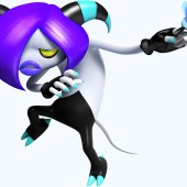
This feeling does not come from nostalgia, as I have never owned a Sonic game in my life. I’ve played his games sure, but never to a point that I would call myself a fan of the Blue Blur. So do not take my statement for mere hyperbole when I say that Sonic Lost World has finally, after what seems like decades, hit a sweet spot for Sonic art design. After years upon years of sad character additions that hinge on a degree of fan fiction we finally have a crew of baddies that look vibrant, new, and most importantly consistent with the game’s look and feel.
The Deadly Six are breath of a fresh air from the games of past which do little more than throw in a new colored animal with a silly name or a boring mecha/robot that is ill-inspired by some other mecha/robot. Fresh faces are typically a sign for groaning in the Sonic universe but this time we are greeted with a set of multi-colored differently shaped crew of cartoonish Japanese Demons. Each boss character can be easily distinguished from their silhouette alone, not to mention their signature color palette. Each one sports similar elements like striped horns and circular black loops in various parts to tie them all to a single allegiance. The designs take a player back to a simpler time of games and almost feel like a modern take on limitations that sprite based design would cause. The characters had to stand out from one another for more simplistic reasons like basic color and shape. This is a fitting tactic to use for an IP that is based at the start of the console wars.
In terms of environment Sonic Generations was a step in the right direction. Probably the strongest element of Generations, apart from the marketing of a 20th Anniversary release, was its art design and packaging. After a long slew of games that are indistinguishable from bad Final Fantasy rip-offs, Generations took the surrounding world back into the cartoonish, sharply colored atmosphere that actually benefits Sonic’s classic blue design. Sonic Lost World has taken that even further.
Sonic Generations though brightly colored had a harsh muddy undertone in certain areas. There were detailed textures that look good in a static frame but became blurred in the obvious fast paced game play. Sonic Generations by no means looks bad, but with the downsizing of realism and heavier use of solid patterns in Sonic Lost World, the Lost Hex has a vivid and energetic feel even when moving at top speed. Level designs are based more on player choice as well. Whether the player wishes to blast through a level or take their time and find items it’s up to the player to decide that. This lends to a lot of better layouts and lets the art design shine through without hindering the gameplay. Reminiscent of Mario Galaxy the levels defy gravity. This adds to the feel of speed the games are known for and alters the paths in an illogical but fun way especially when they are so nice to look at no matter the path.
From a purely visual point of view Sonic Lost World is a huge step in the right direction for the Sonic franchise. I personally have never wanted to play a Sonic game since Sonic 2 on the Genesis. The crisp colors and flamboyant character designs fill a certain mold that leaves the impression that Sonic Team has finally found their footing in a long sense hindered property. Be sure to check out Sonic Lost World if only for a trip down memory lane when Sonic’s fast paced gameplay looked inviting, spirited and most of all fun to play.

